

Although, the previous logo had a special meaning representing the founders initials, they had an outdated logo that didn't look suitable for the painting company.
Logo wasn't responsive on phone or tablet breakpoints.
Typography didn't match the construction and light modern renovating touch vibe, wasn't responsive on mobile and tablet breakpoints as content would cut off which drove users away, which was a missed opportunity.
Majority of the text did not exceed colour contrast guidelines to accommodate all types of users with visual or hearing impairments.
Spacing between visual elements text wasn't legible enough causing clutter causing confusion scanning content on website.
Website content would cut off making it not user-friendly on other breakpoints.
Lack of benefits of why pick A&A Renovations over competitors, How it works as customer's may be curious of how much effort to go through the painting process, available spots left, and lack of social proof (how many projects completed, customers satisfied, experience, more testimonials).
The copy was decent. However, it could've been massively improved to trigger emotion also telling a story as the user navigates through the website.
Generic stock images which may not gain client's trust.
Before Version
Below, is the full website of the 'before' version.


After Version


Branding Improvements
Fresh modern logo that represents ladders and buildings which are elements associated with construction as well.
Not only this, it represents the founders initials that founded A&A Renovations together since day 1, which means a lot to them.
Also, logo is responsive on all breakpoints.
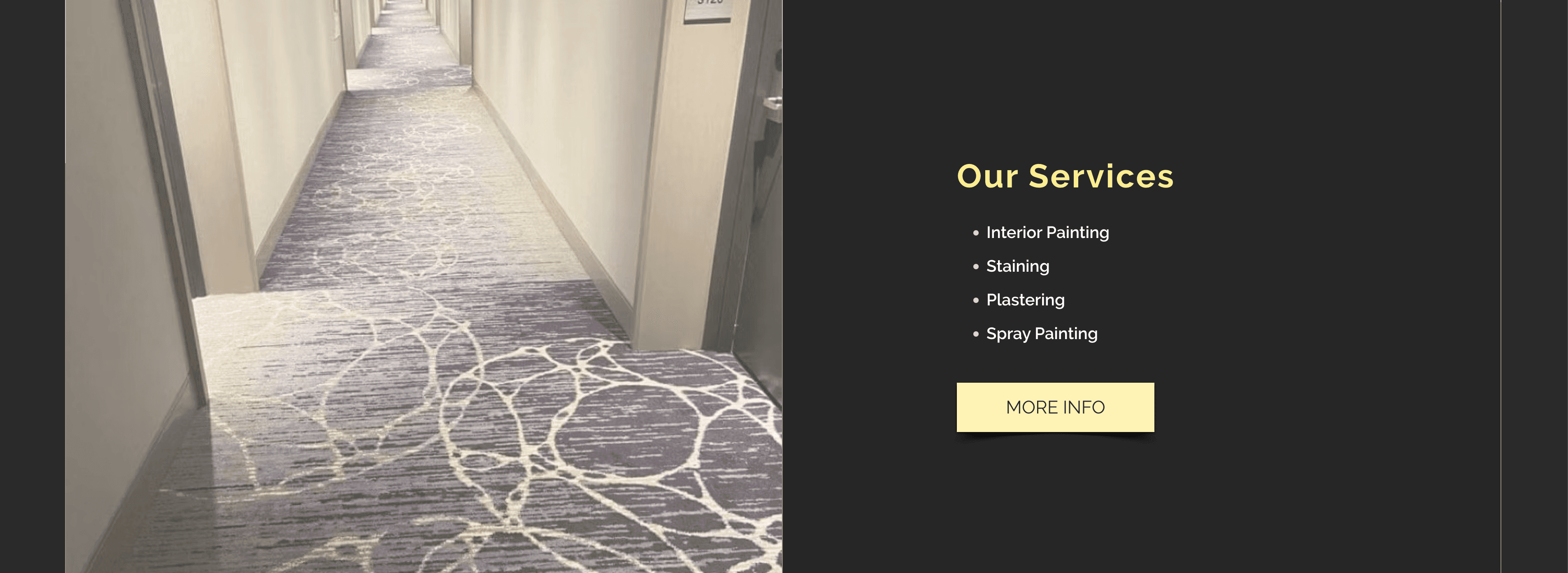
Modern Interface with Simple Language, Fast and Responsive Design
Simple, fresh, and easy to scan website highlighting services and key benefits of choosing A&A Renovations.
Fast loading speed, responsive layouts across all breakpoints.
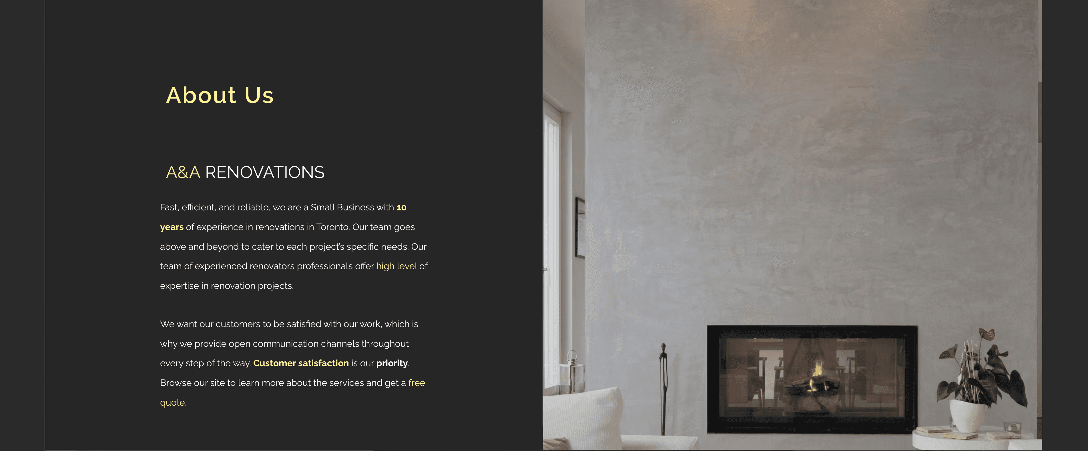
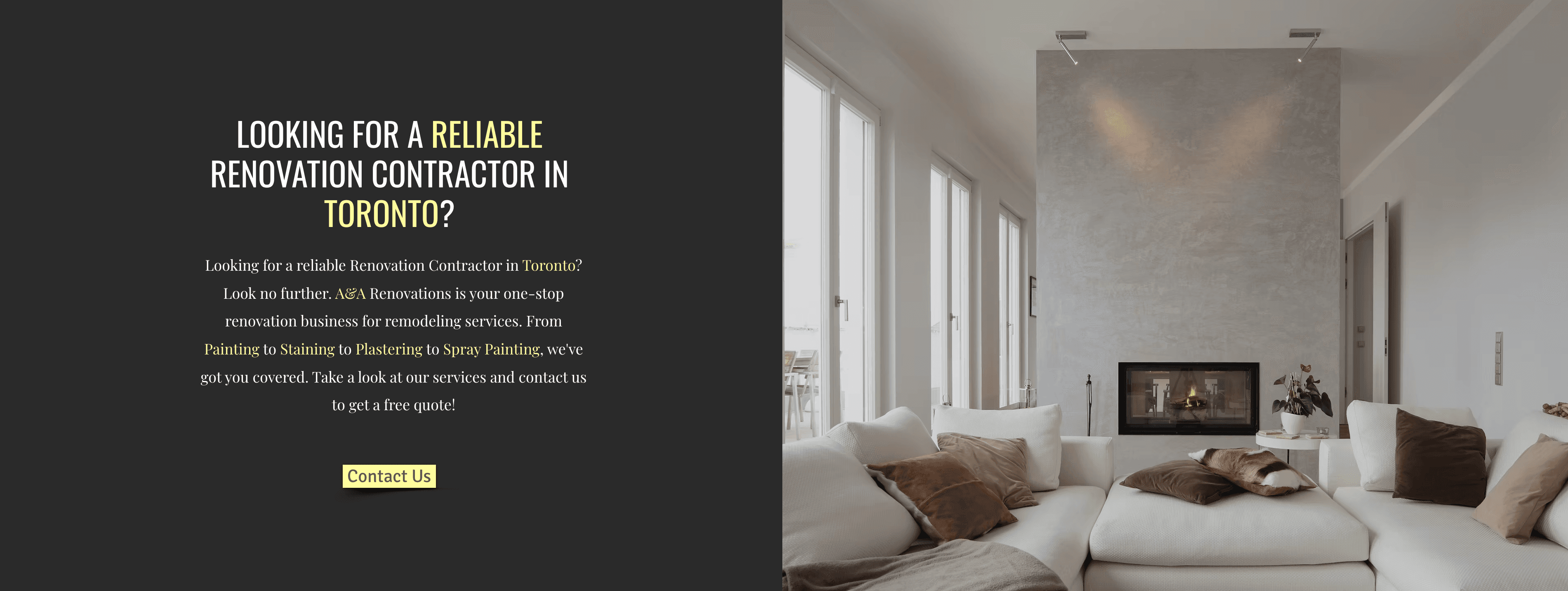
Authentic Voice with Professional Feel & Look
The website was designed with a modern construction touch and feeling to it, also making it look professional for a painting company.
Copy is easy to understand, no jargon, no need to search up meaning of words.
The copy triggers emotion of highlighting the customer's pain points and how A&A Renovations can cure the pain with their great customer experience and using their painting tools to make home dream ideas come true.
How It Works section to make the client imagine their easy painting journey with A&A Renovations.
Real life images that show the founders and their work. Website also displays famous companies as social proof showing A&A Renovations collaborations & their years of experience, boosting their authority.
Not only these companies but more testimonials also showing their faces. This all boosts the client's trust level.
The website not only has an authentic voice, it's designed speaking directly to their target audience.

Angela Diaz
Founder of A&A Renovations
My partner and I needed a website redesign for our company. Melanie took care of us with a modern website in less than a week. I was amazed.
I've received great results. I will definitely work with her again in the future.
She responded very fast, has amazing work ethic, went above and beyond from research to delivering my website with pure results and perfect branding that I needed. I can't wait to work with her again.
Just a genuine 15 min conversation between me and you planning success together.
Booking limited spots, secure yours today.
